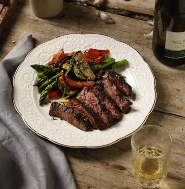
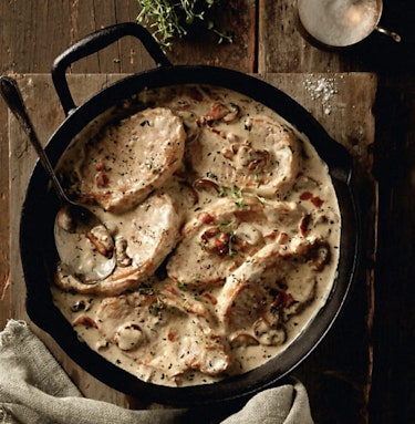
Crafting the universe of food content creator Folks & Forks.
Frédérike Lachance-Brulotte, aka Folks & Forks, has soared in popularity across French Canada, initially through her blog. She then gained traction across social media platforms, enticing foodies to savour the flavours of Quebec right from the heart of her kitchen. Her rustic style is deeply rooted in cherished memories from her youth, spent at the family inn. She instills a sense of joy and togetherness around dining, emphasizing the warmth of shared meals.
Sculpture has implemented a comprehensive overhaul of her branding to enhance market presence while retaining her very own appeal. This revamped visual identity has propelled her visibility across diverse media outlets. Although Folks & Forks had already earned a substantial online following across Quebec, the launch of her debut cookbook in 2021 marked a pivotal moment in her career. Under Sculpture’s creative guidance, the book weaves a narrative that deepens the reader's connection to authentic, heartwarming Quebecois cuisine with a strong sense of family spirit.

LOGO
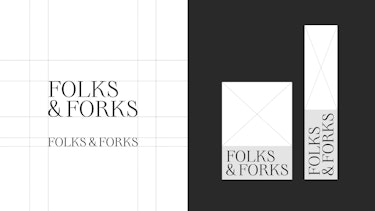
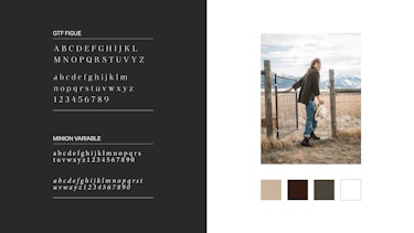
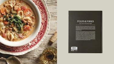
The new logo exudes timeless elegance, inspired by 20th-century calligraphy. With a nod to tradition, the serif font adds a refined touch, while its adaptable positioning ensures effortless recognition and visual harmony. Placing the logo strategically on the spine of the book not only enhances visibility but also seamlessly extends to product packaging, enriching the brand's aesthetic appeal across multiple mediums.
VISUAL ATMOSPHERE
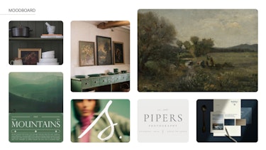
Drawing inspiration from classical paintings and the earthy tones found in Frédérike's dining room, the visual identity of Folks & Forks stands out from other food content creators at first glance. To further highlight this distinctiveness, an image treatment blending modern flair with rustic aesthetics has been crafted. The use of vintage paper and illustrations reminiscent of botanical sketches brings to mind past eras, adding a natural character to the atmosphere.
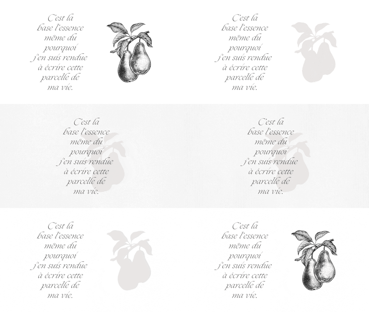
PHOTO EDITING
Here, the original photography is first cropped and then edited to mimic the texture and flow of brush strokes on canvas. This filter seamlessly applies to Frédérike's photos, ensuring consistent branding across social media platforms.

COOKBOOK
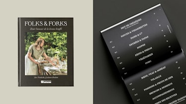
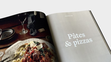
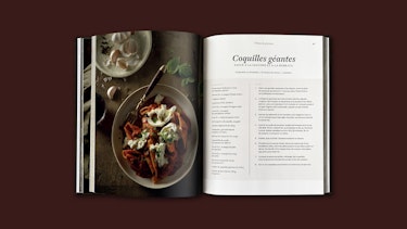
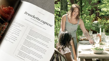
The intention was to craft a book reminiscent of old, well-loved volumes found in libraries, brimming with history and vitality. Collaborating closely with the client, we aimed to make the reading experience truly unique by infusing her creativity into the editorial layout. By introducing unconventional designs, such as a vertically arranged table of contents, we ensured the book captivates readers from the moment they open it.
This bold approach invites readers to engage with the book from a fresh perspective, encouraging exploration and interaction. In addition to the innovative layout, we developed various templates to accommodate diverse text formats, from recipes to lifestyle content. As a result, each page offers a dynamic and cohesive reading experience, reflecting Frédérike's creative spirit perfectly.

ONLINE CONTENT
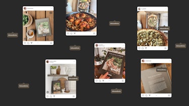
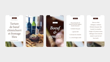
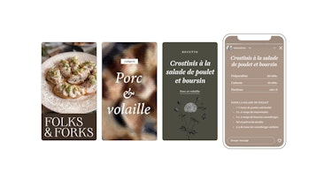
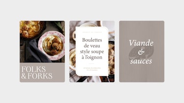
Following this, the visual atmosphere was extended to social media, ensuring uniformity between online posts and the book's content. This strategy cemented Folks & Forks as a recognizable brand, strengthening its visibility and influence on digital platforms.


MERCHANDISE
To elevate the brand experience, Sculpture extended the visual atmosphere to merchandise and recipe cards. Seamlessly aligned with the book's aesthetic, these elements ensure a unified experience, strengthening the bond between the brand and its audience.


CREDITS
Client: Fédérike Lachance-Brulotte — Folks & Forks
Publisher: Pratico-Pratiques
Marketing strategy: Nadège Dionne-Tremblay & Karim Marier-El Khayat — Sculpture
Art direction and graphic design: Nadège Dionne-Tremblay — Sculpture
